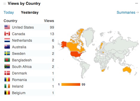
This chart depicts the visitors to AsOurParentsAge on Thursday, March 15, 2012. A great feature of WordPress and very cool that I can follow how many of my blog visitors come from various countries on a daily basis. At some point I’ll post a more dynamic blog visitor map. WordPress recommendations?
- Comment
- Reblog
-
Subscribe
Subscribed
Already have a WordPress.com account? Log in now.

Pingback: Switched over to WordPress | Adena's Writings
Pingback: Switched over to WordPress | Master Huldschinsky's Adventures
It covers other content on your main page making it hard to read.
LikeLike
A good observation about the data and content. My main reason for cutting this out and making an image to display was just to marvel at the many countries represented on a single day!
LikeLike